Volvo Dealer Website Example
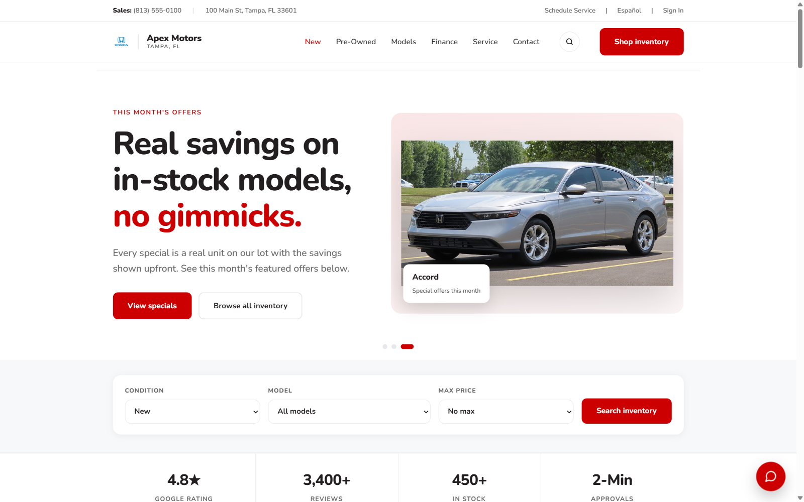
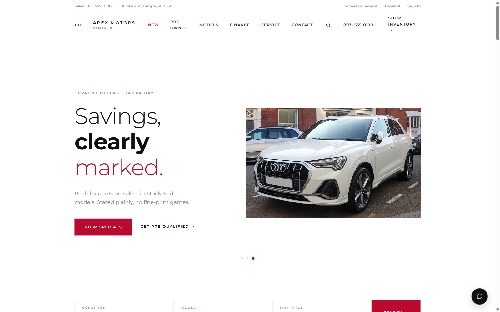
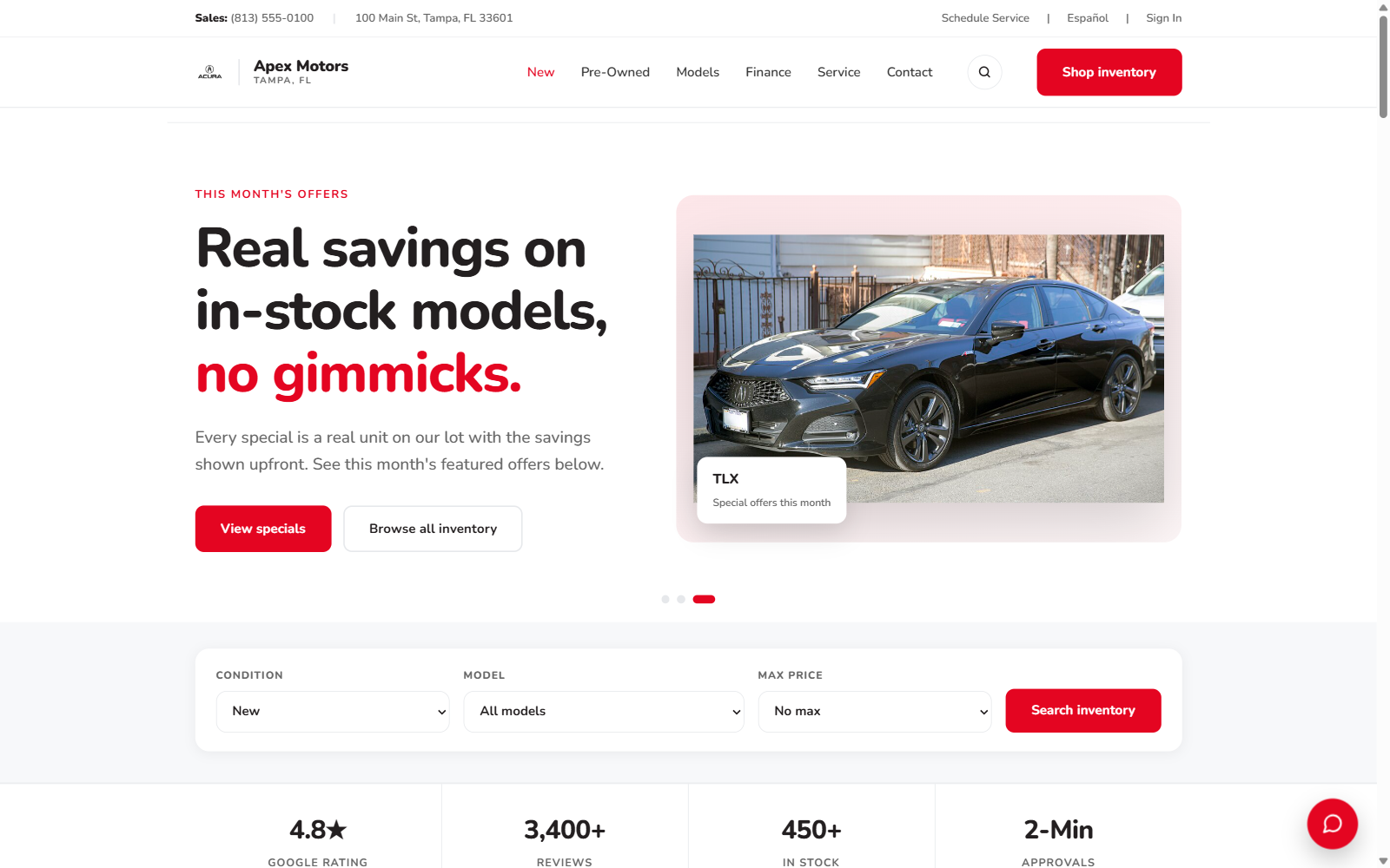
Scandinavian design is Volvo's home turf, so the website gets to practice what the brand preaches: light, air, and nothing unnecessary. This example uses our editorial airy style, framing the XC90 and XC60 in calm whitespace with the safety and electrification story told in plain sentences. The serenity is fully wired, with working inventory search, payment tools, and service scheduling underneath.
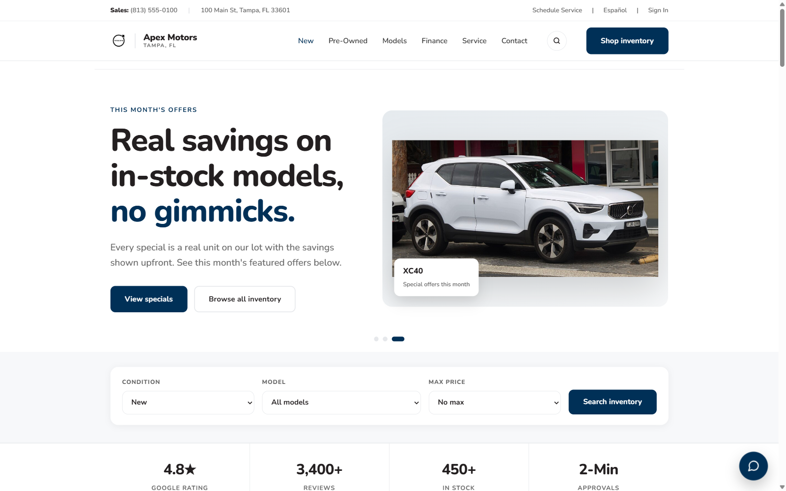
Homepage of the Volvo example. The full demo includes inventory search, vehicle detail, service, finance, and contact pages.
What this example includes
- XC90 and XC60 led hero with Scandinavian calm
- Plain-language safety and electrification storytelling
- Inventory rail with working filters and counts
- Payment calculator and trade-in band on the homepage
- Specials with restrained, compliant presentation
- Reviews tagged by source
- Footer interlinks across the Volvo lineup
See it with your store's name on it
Book a demo and we'll build this design with your store's name on it, pulling your live inventory where your current site exposes it.
Frequently asked questions
What should a Volvo dealer website include?
A Volvo dealer website should present the XC90, XC60, and XC40 with clean photography, tell the safety story without jargon, give plug-in hybrid and the EX electric range clear incentive and charging answers, and keep inventory search, payment calculation, and service scheduling effortless.
Why is editorial airy the right fit for Volvo?
Volvo's identity is Scandinavian minimalism with warmth, and the editorial airy style mirrors it: sentence-case headlines, soft structure, and generous light. A heavy or loud design would argue with everything the brand stands for.
Can I preview a Volvo demo for my store?
Yes. Book a demo and we'll put this design together with your store's name, your city, and your vehicles.